
Abstract
Keywords
In the early 1990s, the philosopher Ernst von Glasersfeld explored the cybernetic dimension of language, focusing on the concept of self-regulation as a mechanism to improve communication while conversations take place. Von Glasersfeld borrowed this concept from the psychologist Jean Piaget who observed how ‘intelligence organizes the world by organizing itself’, suggesting that knowledge has an adaptive form that changes according to the actors taking part in it (Von Glasersfeld, 1992: 3). By reinterpreting Piaget’s maxim in cybernetic, Von Glasersfeld emphasized that individuals comprehend each other through an endless cycle of language adaptation, whereby communication becomes increasingly effective through dialogue. When a linguistic circle reaches what Piaget (1975) terms ‘equilibration’, two individuals have reached a common language that enhances mutual understanding.
This text builds on the idea that the cybernetic loop of mutual understanding can be applied to communities in the process of finding a common language. Based on this foundation, the study aims to represent communities by utilizing techniques of text analysis (Manning and Schütze, 1999) and network visualization (Lima, 2011) to create novel forms of organizational charts that have not undergone significant enhancements since Willard Brinton’s survey (1919[1914]) This new form of organizational charts, or more broadly visual methods, will allow for a more profound understanding of language-based communities. The premise is that language can be regarded as a form of connectivity that transcends barriers imposed by hierarchies or seniority, thereby facilitating a more democratic method of mapping individuals within groups (Rodighiero, 2021).
Unlike individual conversations, measuring and visualizing the language of a group presents greater challenges due to the complexity of linguistic connectivity. If we imagine a network composed of individuals and each word they use, then the number of edges surpasses the limits of imagination. In such a context, scientific communities represent a fascinating territory to explore. In diverse venues, the scholar activity leaves behind discernible textual information, which Tim Ingold (2007: 43) refers to as traces and Bruno Latour (2014) refers to as digital traces. Specifically, textual traces offer valuable opportunities for analysing and visualizing the linguistic dimensionality, thus enhancing our understanding of self-regulated groups. This process can be achieved through the creation and interpretation of images that represent these communities through texts. Graphic design holds a significant role in the process as the linguistic connectivity is intricate and difficult to comprehend without the aid of visual aids. Recent technological developments have left room for innovative studies that could shed light on linguistic self-regulation, revealing the linguistic structure of scientific communities.
Over the centuries, linguistics has been the subject of numerous investigations by scholars from various fields, including Ferdinand de Saussure and Noam Chomsky, to name a few (Matthews, 2003). The middle of the 20th century saw the emergence of a radical statement within this scientific community, arguing that words were not coming with meanings (Finch, 2000: 143). For instance, according to the linguist W Nelson Francis (1967: 119), ‘Words do not have meanings; people have meanings for words.’ Similarly, the philosopher Ludwig Wittgenstein wrote that ‘speaking of language is part of an activity, or a form of life’ (Wittgenstein 2009[1952]: 15). It can be said that words acquire meaning through their contextual use, rather than solely relying on definitions. This fundamental understanding leads us to the crux of this article: words possess meaning only when they are employed within specific contexts, rendering the definition of words inherently tied to their use and not to written definitions.
The prospect of eliminating dictionaries, taxonomies and other classification systems – caused by the recent advancements in artificial intelligence exemplified by Large Language Models (Amaratunga, 2023) – makes it possible to start conceiving self-regulatory classification systems based on book contents rather than classification systems, in a sort of Seemingly purely technical issues like how to name things and how to store data in fact constitute much of human interaction and much of what we come to know as natural. We have argued that a key for the future is to produce flexible classifications whose users are aware of their political and organizational dimensions and which explicitly retain traces of their construction. In the best of all possible worlds, at any given moment, the past could be reordered to better reflect multiple constituencies now and then. Only then will we be able to fully learn the lessons of the past. In this same optimal world, we could tune our classifications to reflect new institutional arrangements or personal trajectories – reconfigure the world on the fly. The only good classification is a living classification.
In a context of self-regulatory classifications and complex language dynamics, the convergence with network visualizations comes naturally. Networks, indeed, prove to be valuable visual tools for finding patterns and insights in linguistic structures. Grounded in the tenets of actor-network theory (Callon and Latour, 2017), this text embraces the assumption that human activity is deeply interwoven with nonhuman actors, which can be found in every single word used during conversation and writing. In terms of representation (Greimas, 1987: 106), individuals find themselves intricately linked to words, which build with humans a mutual relationship that crystallizes the social structure of language (Ferigato et al., 2009). In this relational perspective, individuals are embodied by the words they employ. The fundamental concept behind this study is that individuals can be effectively depicted through their usage of words and network visualizations serve as a potent means of revealing the linguistic interconnectedness that pervades communities without diminishing the significance of everyone.
Building upon this premise, the present text unveils a series of experiments focusing on representing scientific communities through their texts (i.e. conference papers, abstracts, presentations, etc.). Using advanced techniques of Natural Language Processing (Manning and Schütze, 1999), the documents composing a corpus are transformed into linguistic vectors that allow the measurement of linguistic similarity between scholars (Mikolov et al., 2013). The multidimensional vectors are then reduced to two dimensions through dimensionality reduction through libraries such as T-SNE (Maaten and Hinton, 2008) or UMAP (McInnes et al., 2018). These values can be seen as a form of mapping, which can be customized by graphic-design into a network visualization (Lima, 2011). The outcome is a visual image that facilitates the reader’s hermeneutic act of interpretation (Caputo, 2018). Images not only abstract the intricate web of academic dynamics but they are also capable of contributing to a profound comprehension of their linguistic patterns. These visual methods offer a new perspective on the intricate interplay between language, individuals and their whole communities.
The practice of representing scientific communities belongs to the larger field of organization theory (Hatch, 2011), where organizational charts cover a key role for planning. Organizational charts provide a distinct perspective on medium and large organizations, facilitating efficient coordination between individuals and top-down management (Hatch and Cunliffe, 2013: 271–279). However, they often rely on a simplistic design that fails to capture the intricate dynamics of human interactions by representing complexity with oversimplified diagrams (Rodighiero, 2021: 28–31). Recognizing this limitation, the Affinity Map was developed to rethink the simplistic design of organizational charts with a richer and more comprehensive mapping through the lens of collaboration (Rodighiero, 2018, 2021; Rodighiero et al., 2018). Inspired by Gilles Deleuze’s concept of actual and virtual (Deleuze and Parnet, 2007: 148–152), the Affinity Map serves as a visual model describing how scholars work together and can potentially collaborate in the future, similar to a recommendation system (Schrage, 2020). In particular, the visual model seeks to reveal the latent laboratory potential – defined as virtuality by Deleuze – through accurate text analysis of scientific literature, measuring the linguistic similarity between units.
The Affinity Map (see Figure 1) uses a hexagonal grid system to visually represent the ENAC faculty at École Polytechnique Fédérale de Lausanne (EPFL). Laboratories are denoted as nodes and the connections between them illustrate various academic collaborations. The final arrangement is determined by a force-layout algorithm (Bostock et al., 2011; Meeks, 2015: 175–203), which positions laboratories on the Cartesian plane. The actual collaborations are described by lines representing collaborations in terms of advising, publications and teaching; on the other hand, the potential affinities are embodied by shared keywords listed between laboratories. This linguistic dimension is conceived to foster interdisciplinary within the faculty: each laboratory’s publications are computed through the TF-IDF algorithm of text analysis, which returns a metric that represents the lexical similarity between units, discarding the most common terms used by the whole community (Manning and Schütze, 1999: 541–544). The map’s design utilizes different sizes and colours for edges and colours, making it easier to distinguish between strengths of relationships (thicker lines signify stronger collaborations) and their relative institute (red for architecture, blue for civil engineering and green for environmental engineering). The hexagonal layout is particularly effective in organizing numerous elements in a clear readable manner. The overall visual design of the Affinity Map not only enhances aesthetic appeal but also significantly facilitates comprehension of intricate academic networks (Rodighiero, 2018, 2021; Rodighiero et al., 2018)

The Affinity Map is a model for mapping academic dynamics, showcasing actual collaborations (advising, publications and teaching) and affinities between laboratories based on lexical analysis. A hexagonal grid allows for placing shared keywords between laboratories, while the network arrangement is determined by a combination of attraction forces. Although the visualization was maintained until 2023, the code is still available on GitHub at https://github.com/rodighiero/Affinity-Map
The Affinity Map model was so effective (Rodighiero, 2021: 111–119) that it inspired a series of mapping experiments with smaller scientific communities. This research stage was conducted in the field of digital humanities, finding the appropriate setting in two conferences organized by Associazione per l'Informatica Umanistica e la Cultura Digitale (AIUCD) and the Alliance of Digital Humanities Organizations (ADHO). The network visualizations created for these events in 2020 (see Figures 2 and 3) helped attendees to orientate in the panels by showing speakers according to their textual similarity (Moon and Rodighiero, 2020; Rodighiero et al., 2020). Visualizations highlighted the most relevant keywords extracted from the abstracts through text analysis, similarly to the Affinity Map. The web-based interfaces published on GitHub allowed conference attendees to zoom into visualizations to identify the names of speakers, accessing more information about the presentations. These interactive visualizations offered a potent means of comprehending the linguistic intricacy that regulates specialized scientific communities, facilitating a more profound understanding of the field’s dynamics.

The network visualization of AIUCD conference showcases connections between speakers based on their most relevant keywords. This map that presents the linguistic landscape of the digital humanities’ community in Italy, borrows elevation lines from cartography to indicate the density of speakers. The code and the visualization (tested on Chrome) are accessible on GitHub at https://github.com/rodighiero/AIUCD2020

The interactive application for the ADHO conference illustrates the digital humanities international community through text analysis. Differently from the AIUCD example, this network visualization introduces a higher level of abstraction to facilitate distant reading: the most relevant keywords of the scientific community are brought to the fore to offer precise entry points to zoom into details. The two levels of visualization can coexist thanks to a sophisticated system of fading. The visualization is available on GitHub at https://rodighiero.github.io/DH2020/
The visual methods described above gained significant relevance during the COVID-19 pandemic when scientific conferences moved online. Notably, the Digital Humanities 2020 conference served as a first testing ground for the efficacy of this technique in a field that understands the potential of data visualization. While it remains difficult to quantify the exact impact of the map, the exchange between users proved intriguing (DH2020@Ottawa 2020), revealing a sense of community among scholars (Rodighiero and Cellard, 2019), echoing from the notion of mutual recognition already developed by Paul Ricœur (2005). This engagement underscores the map’s utility not just as an analytical tool but as a means of fostering the community among researchers, even in the absence of physical interaction. The visualizations became a helpful component in developing ties, demonstrating the importance of digital tools in navigating the challenges posed by the pandemic. This scenario also highlights the significance of data visualization in academic meta-discourse, especially in times that demand innovation in communication and collaboration methods.
During the pandemic, the same method was tested to represent scientists working on the crisis (Rodighiero et al., 2021, 2022). The resulting image (see Figure 4) showcases the most active scientists engaged in pandemic-related research, highlighting the prominent themes that emerged from their paper abstracts. Interestingly, those themes did not always align with the topics receiving attention from the media, revealing a fascinating discrepancy between scientific focus and public discourse. Examples of this discrepancy were seen in the extensive literature concerning pregnancy and mental anxiety. The visual representation of Covid-19 research emphasizes the dedication and contributions of the scientific community in tackling the challenges posed by the pandemic, underscoring their commitment to advancing knowledge in the critical situation. The recognition received from Newcastle University through the DH Award for the best data visualization underscores the value of the method in capturing the community of scientists during this unprecedented time.

This visualization presents a macroscopic overview of the most active researchers during the COVID-19 crisis, mapped by lexical similarity. It presents together the essence of collaborative efforts and thematic diversity, underscoring the commitment to mitigate the pandemic’s impact. In comparison with the previous examples, this version provides a more accurate distribution of forefront keywords but limits the number of nodes because of the graphics-intensive workloads. The visualization is accessible on GitHub at https://rodighiero.github.io/COVID-19/
The visual method underwent refinement in terms of programming and graphic design. In 2021, for the conference of the Society for Philosophy and Technology (SPT), text analysis was rewritten in Python, opting for a more accurate language model offered by spaCy (Honnibal et al., 2024[2014]), and dimensionality reduction was used for the spatialization, finding in UMAP an optimal solution (McInnes et al., 2018) (see Figure 5). This latter technical advancement gave the possibility of rethinking the foreground layer of keywords, which was replaced by more readable word clouds to represent the content of the clusters created by word frequency. This approach better described clusters by emphasizing the identity of thematic groups instead of individual edges. Attendees found this visual presentation to be highly valuable for exploring the conference and gaining a tangible image of the scientific community working at the intersection of philosophy and science (Rodighiero and Romele, 2022).
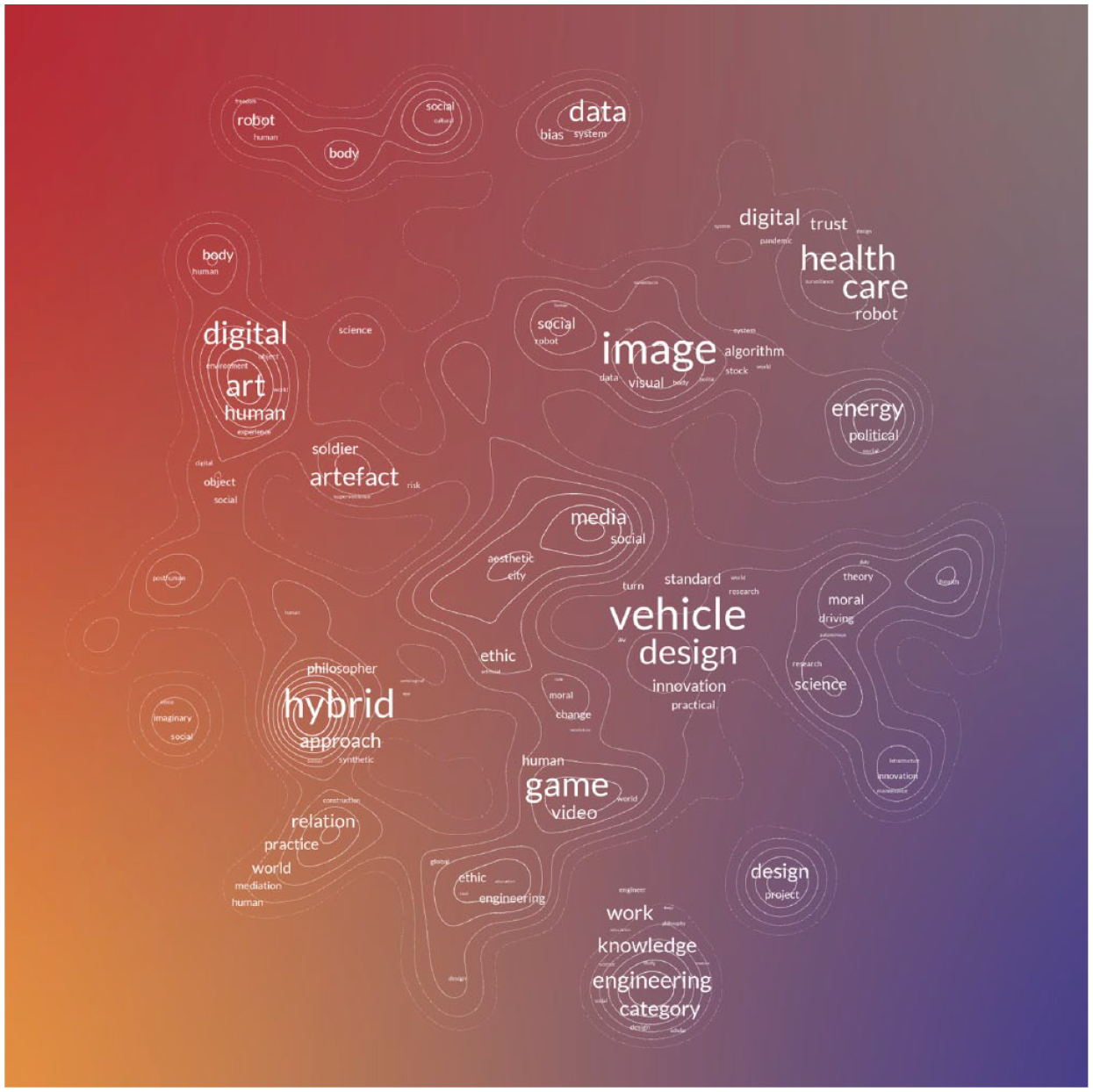
This visualization shows the evolution of the visual model in a case study concerning the SPT conference. Representing clusters with word clouds offers a more abstract way to visualize trending themes within the community. The visualization is accessible on GitHub at https://rodighiero.github.io/SPT2021/
In conclusion, this text presents a series of experiments that explore the potential of information design in analysing scientific communities. The intersection of network visualization and text analysis creates novel images for representing scientific communities. This visual method has larger fields of application, though. Library collections and text archives offer interesting material for testing the model on questions related to classification. An interesting prototype was recently developed for the PAP paper manuscripts by the philosopher Charles S Peirce (Picca et al., 2023). Emphasizing the capacity to organize knowledge into thematic clusters, the lexical mapping can potentially overcome the static classification systems used in libraries, opting for a knowledge self-organization (see Figure 6). These visual methods present real opportunities for exploring and understanding the intricate structures of language in corpora. By harnessing the power of visualization and text analysis, researchers can unlock more in-depth insights into linguistic complexity and foster visual exploration.
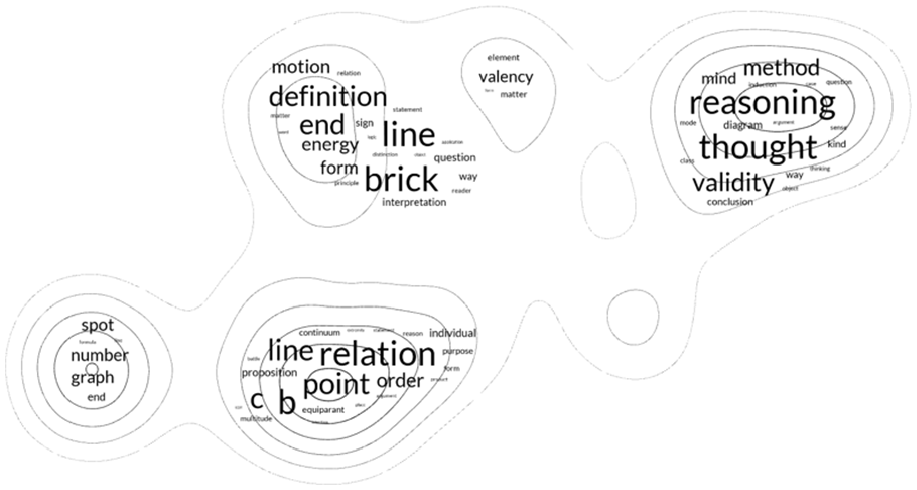
This figure introduces a web-based application showcasing a UMAP visualization that organizes the PAP manuscript pages into a coherent visual classification. By incorporating advanced graphical elements, the application transforms textual analysis into an intuitive visual map, revealing underlying thematic clusters through word clouds. This innovative representation allows users to navigate Peirce’s manuscript in a novel way, offering insights into the manuscript's thematic structure and enhancing the exploration of its complex ideas. The code and the visualization are accessible on GitHub at https://github.com/rodighiero/Charles-S-Peirce-PAP